
Liverpool John Lennon Airport refreshes brand
Liverpool brand marketing agency Kenyons helps deliver brand refresh for Liverpool John Lennon Airport
Liverpool John Lennon Airport (LJLA) has refreshed its branding 22 years after it was renamed after Beatle John Lennon.
Local brand marketing agency Kenyons has helped deliver the “subtle transformation” to the branding which includes the famous John Lennon self-caricature.
The illustration has moved from the right to the left so that it is now at the forefront of the brand, with updated typography.
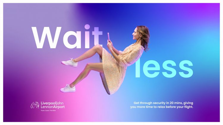
This, says LJLA, make it appropriate for digital use and modernises it with a block colour, rather than the red and blue of old. The Liverpool John Lennon Airport name and the ‘Faster, Easier, Friendlier’ strapline remain.
In early July the airport celebrated its 90th anniversary. It officially opened on July 1, 1933 as Liverpool Airport, often referred to locally as Speke Airport, and was renamed after John Lennon in 2001.
LJLA’s digital marketing executive, Tom Woods, who has led the brand refresh for the airport, said: “It is really exciting to reveal our new brand to the public. This is the culmination of months of work, so it’s nice finally to get it out there for everyone to see.
“The original logo was created in 2001 before smartphones and social media, so a refresh was long overdue and now seemed like the perfect time.
“This year we’ve celebrated our 90th birthday and following the launch of Lufthansa, PLAY and Aer Lingus, as well as the announcement of Jet2 we needed a brand that was ready for the exciting years ahead of us.”
The airport has also rolled out a short video to explain more about the thinking behind the brand refresh which can be downloaded here.
READ MORE: Liverpool Airport set for busiest summer since 2019
Aaron McDonald, creative development director at Kenyons, added: “It has been a privilege to reimagine one of the most iconic names in the UK.
“We wanted to create a new look that represented the friendliness, positivity and vibrancy that the airport and its staff show every time we visit. The project has been a labour of love and we cannot wait for their passengers to see it.”